To customise your portal, select Support in the navigation bar and open a ticket containing the hyperlinks and images required.
The following look and feel customisations can be made to the Self-Service portal:
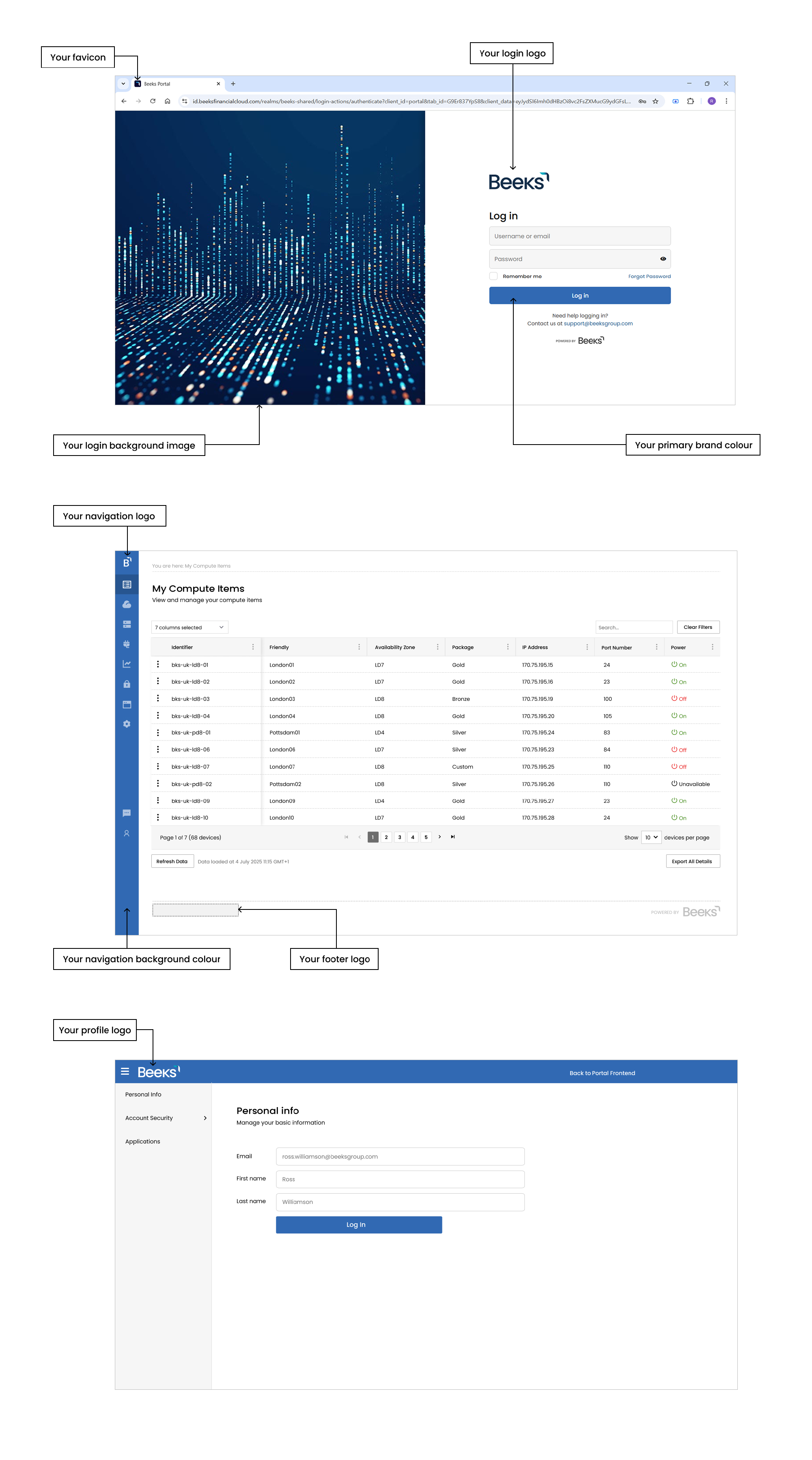
Customisation | Location | Description | Filetype | Expected Dimensions |
|---|---|---|---|---|
Your login logo | Login/forgot password page | Logo image located on a white background | SVG (or PNG) | Max width 150px |
Your login background image | Login/forgot password page | Background image | JPG | Width: 1500px |
Your profile logo | Profile page | Logo image located on your navigation background colour. | SVG (or PNG) | Max height: 34px |
Your navigation logo | At the top of the left navigation bar | An icon-sized image to represent your brand. | SVG (or PNG) | Any, but height and width must be equal |
Your navigation background colour | The left navigation bar and at the top of the Profile page. | The background colour of the left navigation bar. By default, this is set to use your primary brand colour. | N/A | N/A |
Your favicon | The URL field in the browser, on the browser tab or window title, or as your browser icon when the page is in focus. | Favicon image. | SVG | Any, but height and width must be equal |
Your primary brand colour | Call-To-Action (CTAs) buttons. | The background colour for CTAs. | N/A | N/A |
Your brand name | On the Build tile buttons for provisioning compute on Proximity Cloud. | Text on the buttons. | N/A | N/A |
Your brand name | In the title of the Build forms that enable you to configure and order a Compute Item. | Text in the title of a Build form. E.g. Configure your new [Your Brand name] Virtual Private Server | N/A | N/A |
Your brand name | In the Cloud column on the Usage Reports page and in downloaded Usage Reports. | [Your Brand name] instead of Proximity Cloud in the Cloud column. | N/A | N/A |
Your footer logo | In the footer of every page. | Logo image. | SVG (or PNG) | Max height 30px |
Additional fields
As well as the look and feel customisations listed above, you can also request customisations to certain textfields and link targets throughout the portal.
Customisation |
Portal Pages |
Reference in this document for an example screenshot of default branding |
Default Value |
|---|---|---|---|
Sales Email address |
Support |
||
Billing Email address |
Support |
||
Support Email address |
Support |
||
User Manual menu option visibility and link target |
User menu (top right of all portal pages) |
User Manual is visible, and points at the manual on the Beeks website. This menu option can be removed, or the link target can be altered. |
|
Copyright text |
Login / forgot password pages |
||
| Terms of Use link target | Login / forgot password pages | ||
| Privacy Policy link target | Login / forgot password pages |
Other details
The Beeks team will also require the following information in order to onboard a client.
- Billing and Sales Support email addresses.
- Distribution list of email addresses that should receive maintenance emails.
- A contact email address for users that have forgotten their username or that do not have an account.
- Acceptance of the Beeks Privacy Policy and Terms and Conditions displayed on screen.