Use case
The end user wants to monitor the latency of two environments, one being a failover environment, to guarantee business continuity in the event of a disruption to the primary production environment.
Dashboard
The Latency Comparison DR dashboard visualises data in timeseries graphs. The graphs on the left (labelled blue) visualise data from a production environment and the green graphs on the right visualise data from the disaster recovery environment. As you’d expect, the graphs are virtually identical, since the green is a hot standby environment.
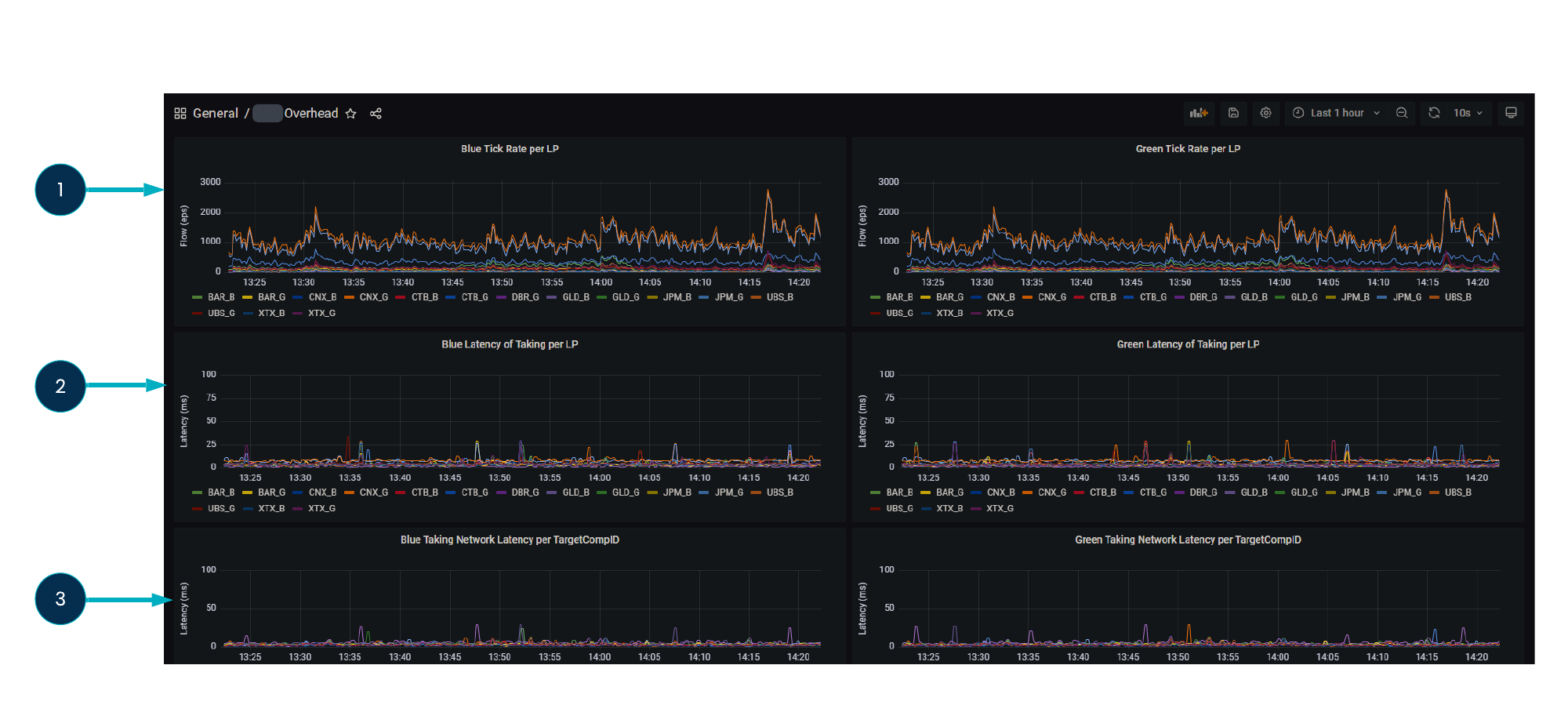
In the top row, the graphs (1) show the Tick rates per liquidity provider.
In the middle row, the graphs (2) show the latency of the same liquidity providers through a pricing system.
In the bottom row, the graphs (3) show the full network latency at the point where we capture the liquidity provider tick going into the pricing system and then the output from the pricing system.