Once you've configured your queries, the next step is to choose how to visualise the data in the dashboard. Grafana supports a huge number of rich visualisations that range from simple gauges and time-series charts to the Detailed Trace visualisation. Read about them here.
Visualisations are configured in the right-hand section of the Edit Panel page.
To choose a visualisation, select the Visualisations tab and select from the menu. The fields in this section are updated automatically to enable the necessary configuration.
Complete the fields as per the Grafana documentation here.
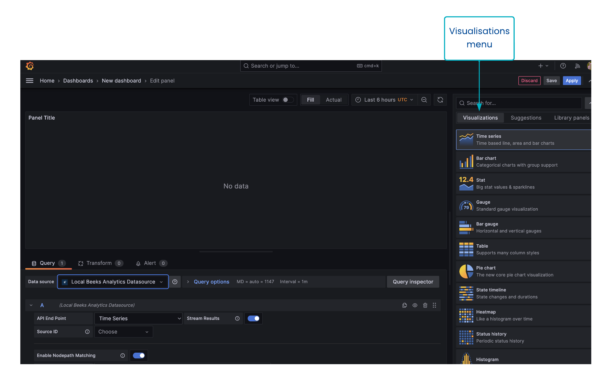
Screenshot: Visualisations field